Defining software quality
If you know, you know


In my last post, I set the stage for how you embark on a software quality journey. The first step of this journey is to formally define software quality for your organization. You may be thinking it’s more important to just get started fixing your quality problems. What’s the point of having a formal definition of software quality?
If you remember our outline of the quality journey, it’s much harder to create a strategy and run a quality rhythm of business if nobody in your organization understands how quality is defined. Is quality defined as reactively fixing issues raised by customers? Is it defined by continually burning down a list of product defects tracked in a bug database?
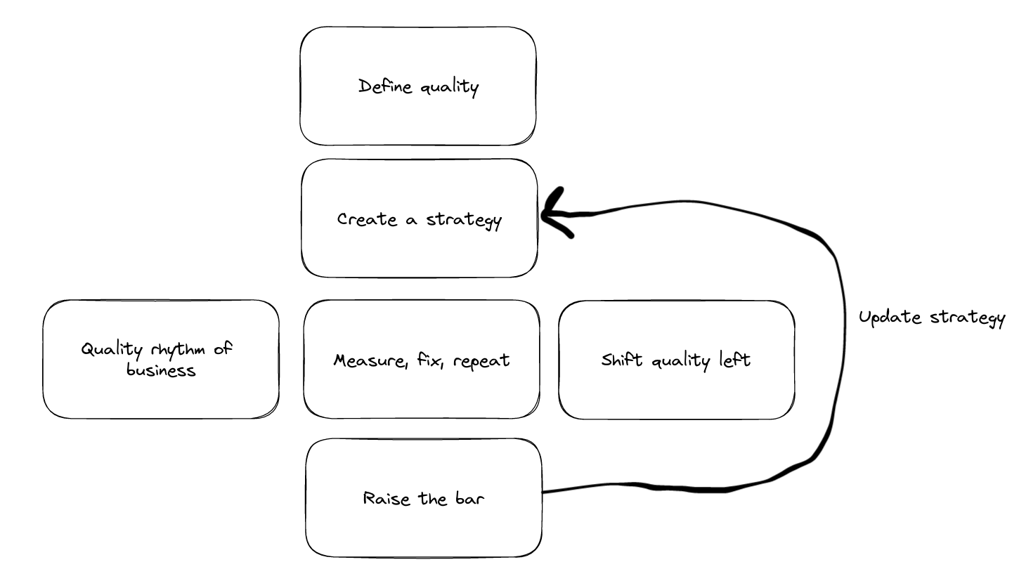
Creating a clear definition of software quality helps align everyone in the organization on the current state of quality, what bad/good/great looks like, and paves the way for setting the strategy on how to improve quality.
A simple frame to break down quality is by dividing between objective and subjective measures, with a set of common dimensions that help you further break down any quality metric. Objective measures are what we can measure and observe through data, whereas subjective measures describe what users tell us and how they feel. We can’t just focus on objective measures because if the data tells us quality is good but users tell us it isn’t, then we’ve failed. We can’t just focus on subjective measures because not all users will tell us that they’re experiencing quality issues.
I’ll also touch on some proxy metrics for quality. These tend to get intertwined in how your organization defines quality, but as you’ll soon see, there are enough core quality metrics that require dedicated focus.
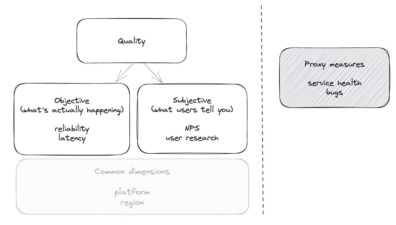
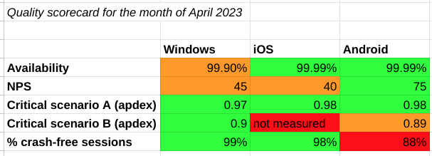
High-level breakdown of how to measure quality, with sample metrics
Objective quality measures
Objective quality measures arise from analysis and aggregation of product telemetry and logging. Having a first class telemetry solution will be essential to collect and analyze these measures in a meaningful way.
Availability, or Uptime
The beauty of this metric is that it’s a simple, up-leveled metric that most people in the organization understand.
Availability is usually expressed as a percentage of time over a time period that the product or service was functionally available. The Google SRE book has a few simple definitions:
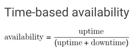
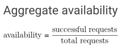
You can start with a manual calculation assuming you have aligned on high severity incident levels. As you mature, uptime can be calculated as the result of real-time monitoring that objectively captures all instances where the product was unavailable.
The degree of success for this metric is referred to as how many “nines” you have. The more nines the better, and the exponential cost of achieving each nine depends on the criticality of the product. 99.99% is what most users expect, which equates to 5 minutes of downtime per month. Some companies are even named after availability, like Five9!
There are many resources to deepen your understanding on this metric:
Critical User Journeys
Availability is a good high-level metric to know how often your product is completely broken, but critical user journeys are where the bulk of your quality definitions will lie.
Measure the health of the most important end user scenarios, tasks, or user journeys in your product. How often do you fulfill the value proposition of your product in the eyes of your end users? A good definition of a healthy scenario will combine reliability (does it work?), latency (how long does it take?), and satisfaction (how do users feel?). Start pulling together a cross-functional team (engineering, product, UX, UX research, program) to align on a list of user journeys ranked by criticality, and precise definitions of the start and end of each user journey.
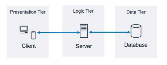
Quality has to be measured as close to what the customer experiences. In a simple 3-tier architecture (pictured below), it’s better to measure reliability and latency end-to-end throughout the system flow than measuring at each hop. You can have 100% reliability at your logic and data tiers, but a bug at the presentation tier will mean a broken journey for the user.
For each critical user journey, measure:
Reliability - measured as a percentage: successes divided by the total number of attempts. Consider this “task success rate”.
Latency - measured in milliseconds and at different percentiles like p50, p95, p99. Averages suck and percentiles are great
Apdex is a great way to provide a simplified, single number to represent user satisfaction, which can combine both the reliability and latency measurements at different percentiles.
Crashes and Hangs
These are the worst type of bugs because the software completely stops working and can result in data loss. This can be measured as a percentage of crashes/hangs across all sessions over time, percentage of all users that experienced it over time, and the top ones ranked by either dimension (most volume or most seen by users). This blog post further articulates the importance of software integrity as the most important dimension of software quality. You may develop a system in house to collect, analyze, and rank these types of defects, or you can use something off the shelf like Crashlytics.
Resource Usage
For desktop products, track CPU and memory usage since these frequently show up in user feedback and are difficult to diagnose and attribute since the user may have other products putting overall pressure on the system. Record the CPU and memory footprint and measure at different percentiles to track your product’s resource usage over time. For mobile products, track battery/power consumption.
Errors
Most software products have error dialogs that indicate when the product didn’t work as intended. Errors get in the way for users to get their job done and blocking/visible errors contribute greatly to the perceived quality of your product. This measurement looks very similar to the crashes and hangs measurement. You probably also have a logging/tracing/assertion system that tracks error conditions observed by your software, even though the error doesn’t surface to the user in a visible way. These are also great to track and fix so you have a clearer signal when error rates rise.
Bad user minutes
Consider taking all of the above (reliability, latency, task success, error dialogs, crashes, hangs, etc.) and observing how many times any of these issues happened in one minute. Call this a “bad user minute”. You can then measure how many users over some time period experience bad user minutes, which may provide deeper insight into the collective impact of different quality issues your users experience. This metric straddles the line between objective and subjective because the product team will define what constitutes a bad or frustrating minute. If a minute feels like too granular of time, consider tracking the user visit or session and classifying the visit as bad or frustrating based on some criteria.
Here is an old yet excellent read on this topic in more detail: How do you measure quality of a service? - Brian Harry's Blog
Jankiness
Measure any user interaction with your product that requires interaction from the user with an expectation for immediate feedback. This can include scrolling, pagination, typing, inking, audio, video, and UI layout redrawing. It requires more effort to define and measure these, and you may debate on what an acceptable amount of time is for a user to get immediate feedback on a UI interaction, but users think of bugs in this area as glitchy or irritating.
Product Support cases
In larger organizations, there is usually a dedicated product support team to field customer complaints. Measure the percentage of product support cases that are confirmed to be product defects, and maintain a list of top support cases by product area.
Subjective quality measures
Arguably the most important quality measures are what your users feel and tell you about the quality of your product. Ultimately the outcome of any quality strategy is to make your customers happier, which leads to increased usage, retention, and revenue, so if all your objective quality metric improvements haven’t improved customer perception, then you still have more work to do!
User satisfaction
NPS - Net Promoter Score measures the loyalty of customers to a company. NPS scores are measured with a single-question survey and reported with a number from the range -100 to +100; a higher score is desirable. Take a look at a few case studies to see how NPS improved product quality.
CSAT - Customer SATisfaction score, is a commonly used metric that indicates how satisfied customers are with a company’s products or services. It’s measured through customer feedback and expressed as a percentage (100% would be fantastic – 0% would be terrible). In addition to measuring this for the entire product, consider contextual CSAT prompts and measurements for your critical user journeys.
NSAT - similar to both NPS and CSAT, but on a 0 to 200 scale. Used at Microsoft and provides users with additional survey options like “don’t know” and “N/A” to rule out unhelpful responses.
App store feedback - for mobile applications, users can rate your app and include verbatim feedback to justify the rating. One great benefit of app store feedback (vs. NPS/CSAT feedback) is that you have an opportunity to publicly respond to dissatisfied users, especially if you’ve since addressed their feedback with a product fix.
For each of the above, the metric tracks something much broader than quality, so use a machine learning algorithm or manual analysis to break down the verbatim feedback and determine what percentage of feedback relates to poor quality. For example, you can track “percentage of NPS verbatim feedback related to poor quality” over time.
Customer interviews - There are many customers who will never fill out your software prompts to rate their experience and provide verbatim feedback. Talk to actual end users of your product if you have an opportunity. If you have access to the CTO or head of IT that purchased your software, they’ll have good insight on the types of quality problems their employees have raised.
Sales and marketing team feedback - it’s critically important for the people advertising and selling your product to believe in its quality.
User research benchmarks or CUJ audits - if you have a UX research team, they can help create scorecards for the critical scenarios of your product and have participants complete the scenarios and provide feedback.
Visual defects - these are harder to represent in objective metrics, but you can maintain a bug backlog of visual defects and track the rate in which the team can keep up with fixing these. Too many of these represents a “death by 1,000 cuts” problem which creates a negative perception of quality.
Common quality dimensions
Once you have high level definitions of software quality, your understanding is incomplete without looking at different dimensions (or slices) of your users. Both your objective and subjective quality measures will require analyzing logs and feedback through different tools, so make sure the underlying systems record some or all of the following:
Platform
Region
Language
Browser type and version
OS type and version
Device type
Version
SKU
Human vs. non-human (bots, test and service accounts)
User cohort - e.g. “power users”
This point is so important for building products at planet scale that I want to reiterate it: don’t fall in love with a metric that looks great in aggregate. For products that have millions or billions of users, you have to look at 95th and 99th percentile user experience across many of these quality measures, and continue slicing/dicing your product usage data to find places where users are not having a delightful experience. Otherwise it’s possible to have all the metrics look great but still have a large number of users dissatisfied. If you have a data science team, they are an invaluable partner in this exercise to draw out quality insights you may be missing.
Proxy metrics for quality
These metrics are harder to correlate directly to end user behaviors, but improvements here will typically lead to better quality outcomes.
Service health
Most products will have compute/storage/service components, which we broadly call a “service” that should be up 24x7. Your service and SRE team should have many service health measures which influence the quality of service your customers experience. Problems here will surface in poor reliability, latency, downtime, and support cases.
“TTx metrics” - TTD (Time To Detect), TTE (Time To Engage), TTF (Time To Fix)
There are entire books written on service quality and culture:
Latest (stable) version
Keep track of what % of your users are on the latest (stable) version of your product. Users on older versions will experience the quality issues you’ve already fixed, so getting users on the latest stable version could have a positive impact on your overall quality measures (unless the rate of incoming defects in newer releases is higher than your last stable release!)
Bugs
I’ve written about this before as the fallacy of fixing bugs. A common pitfall is to equate your bug backlog with your quality plan. While it may be true that taming your bug backlog will increase quality in the product, there are many more reasons why this thinking is flawed:
Your bug backlog is a mixture of product defects and other item tracking
Bugs usually represent specific, non-measurable instances of a problem
You don’t know what you don’t know - bugs are usually reactive reports by specific customers or internal users
Have a strategy for bug hygiene (staying on top of incoming bugs), but don’t trick your organization into believing that fixing your bugs solves all your quality issues.
Where defects are found
Having good accounting of where your product defects are identified will help you understand your quality culture and whether quality has shifted left. This is a proxy metric for “shifting quality left”.
For example, most large organizations practice phased rollouts, or validation rings, to progressively disclose software to larger and different populations of users, and these stages can be captured as metadata every time a defect is found.
Code quality
The quality of your code may be a proxy or signal for parts of the product that have or will generate product bugs. Pay close attention to this but treat code quality as a separate but related effort to improving product quality.
Supportability
When users encounter issues with your product, they may reach out to your product support team. The ease, speed, and delight in which their issue gets resolved deserves its own attention. FDR (First day resolution) rate, CSAT (satisfaction with support experience), and monitoring case volume will help measure the supportability of your product, not the quality of your product. Partner with your support team as a funnel into your quality program and a channel to your customers’ voice.
Putting it all together
Having these definitions should now pique your curiosity on the quality of your software! Start engaging a cross-functional leadership team across PM, UX, UXR, and PgM, and senior engineering leadership to solidify and publish these definitions. Create a simple document that outlines the quality definitions along with a manually curated dashboard to represent the current state of quality.
Though we’ll talk about strategy and execution in the next section, you can start raising awareness on some of the worst quality measures (or lack of measures) and start fixing some issues. If you’re having trouble focusing on which metrics to start paying attention to, consider this nice framework: Maslow Hierarchy for Software Quality.
Next time we’ll talk about how to create a quality strategy centered around this definition of software quality. What is the state of quality today, why is it important to improve it, and how will we do it?